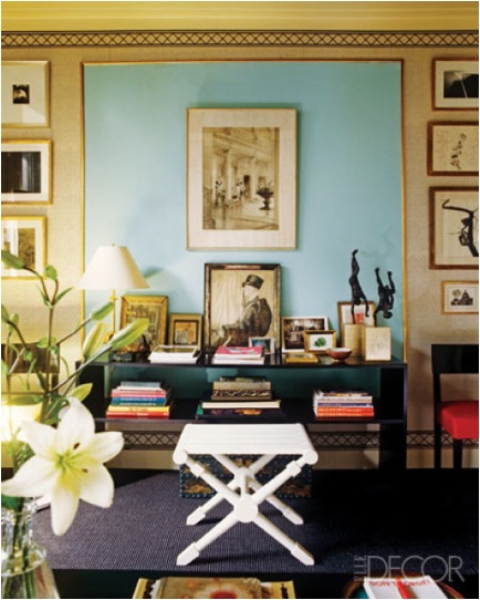
 Because our floor plan downstairs is really open, I decided to stick to one paint color for ALL of the walls. I chose Martha Stewart's Artesian Wells - a sort of faded robin's egg blue. It is similar to the blue here:
I also absolutely love the GOLD accents with the blue paint, and will be incorporating that into my overall scheme as well!
 For the office I chose a rosy lavender color called Violet Aster, also by Martha Stewart. This color seemed just enough to inspire, but not overwhelm me when I was working (or to keep any guests from sleeping as this room doubles as a guest room). It is similar to the color on Jessica Stam's living room wall, pictured above.
The bedroom will be a soft dove gray, the color is called Notre Dame by Valspar. I love gray, it is soothing, neutral, and just cozy! The gray is close to the color in this lovely living room:
All of the pictures are inspiration rooms from the Elle Decor LookBook, check it out!

